KNGS Advanced Portfolio Brad Taylor
Wednesday, 9 December 2015
Evaluation question 3 - 'What have you learned from your audience feedback?' + Survey results
We also conducted a survey for our audience feedback:
In my private screening/audience focus group of our music video all of the feedback was very positive; there were comments such as ‘good camera shots’, ‘message is given clearly’ and ‘nice flow and rhythm’ which can all be seen above. The majority of the comments made at the private screening were that they liked the editing and the pace of the video, this is particularly pleasing to see as we amended the editing various times throughout the post production stage. For example, we started off with the music being completely out of sync with the footage and thought that that was average, we started to improve our skills and editing by synching the montage footage with the beats of the song as that fitted well and made our video look neater and cleaner. We showed our class this and got interim feedback from them saying that the editing was still sloppy in places, we took this criticism on board and therefore changed the whole video pace and rhythm so that it fitted beautifully with the video footage and shots. This made our video look a lot better as the editing was sharp, neat and added to the narrative, the amendments we made clearly made a difference as the audience feedback clearly shows that the comments made about our editing were very good and positive.
We also created a survey on survey monkey about our promotional package as a whole so we could get audience feedback on our digi pack and advert as well as our music video, the results are presented above via slideshare. The results for our audience feedback were slightly mixed but the majority were positive comments; for example, when asked if they liked our promotional package 66% agreed and 22% strongly agreed. A further 77% said that they thought it fit our genre and 44% said they would purchase the promotional package in store due to reasons such as ‘very appealing to my age range’ and ‘looks good and interests me’. The majority (55%) of people who answered the survey were aged 18-24 which is good as our target audience was also around this age bracket as we thought that the narrative and themes of our indie promotional package would be best fitting and more relevant to younger people. Despite all of the positive feedback we also had some neutral feedback and some criticism from the survey; for example, 11% were neutral as to whether they liked our promotional package and 11% also said they would not purchase our promotional package in store because it wasn’t their favourite genre. Furthermore, the fact that 22% said that only sometimes did it feel that the package actually fit the indie genre; this means we could improve it by adding more familiar codes and conventions of the indie genre and also making the genre more clear via. More vivid themes and attitudes.
Sunday, 15 November 2015
Final product - Digi pack
We progressed from our first digi pack draft to our final one as we originally started with the idea of having a pop art inspired colourful inlay, we worked hard on this and then presented it to our class for interim feedback. The audience response was to change this as it didn't really fit the genre and didn't really show continuity with our front and back cover, therefore we changed the inlay to a photo used in our storyboard as it perfectly summed up the indie genre and also it matched our front and back cover. If you look at our final digipack you will see how we have a much more professional and consistent digipack that doesn't just link to the indie genre but also has common themes seen in our music video and advert.
Final product - Advert
Upon reflection, and looking at other products of the same nature, we found that our third draft does not look professional enough and therefore we went back to our original ideas of including the shoe, as this will help us create a link across all the products and also give our products one definitive symbol which would help to conform to the ideals of indie artists also. One mistake we made with the third draft was not including reviews or company logos, which we acknowledged and included in our final draft. Overall we are extremely pleased with the outcome due to the professional look and effective wording used, along with the clear link to the other products.
Digi Pack - Drafts
Digi packs final from flubdub135
Draft3:
Digipack drafts commentary:
Draft 1:
To gain an idea of how we would like our digipack to look, we used professional images that we do not own so we knew what to shoot when it came to taking the actual photos. However this was only for the front cover and inlay. For the back cover, we used an original image however we felt as though we could not find a text colour that complimented it.
Draft 2:
For the front cover of draft 2 we used the same image however we wanted to be original and unique (like our genre) therefore we placed the album name on the stripes of the shoe. This time the inlay is an original image we took whilst shooting our storyboard that we actually found more effective than the style we attempted in draft 1. This is because we wanted to stick with the theme of outdoors to link with the iconography of the genre, which we also presented through our music video so they link together. The back cover is similar to draft 1 however we thought the slightly different lighting may compliment the text better, however it did not.
Draft3:
The front cover of our third draft is an original image that is in the style of the professional image we used in our other drafts. We shot this image in the train station setting that our other images (and video) were shot in to provide continuity to our digipack. We decided to keep the inlay the same as we gained positive feedback on it from the rest of the group. For the back cover we used an image that helps to present the band more, as not only were the other images not fulfilling our aims but also the band are not seen in the video so we thought that they needed to be seen somewhere as indie artists are known for their image just as much as their music.
Wednesday, 21 October 2015
Advert - Drafts
Advert drafts commentary:
Draft 1:
For the first poster we decided to use the image from our digipack inlay as we gained positive feedback from this and also provide continuity to our advertisement campaign. We placed the album cover on the tracks of the image as it links to our album title 'on the move'. This did not work though as it looks out of place. The text colour also did not compliment the image at all therefore we decided to try a new image.
Draft 2:
This image is a still from our music video that we found particularly effective. The lighting however lets the quality of the image down and when the album and Rough Trade logo are placed on it it makes the image hard to make out, so once again we decided against it.
Draft 3:
We felt as though our third draft is effective due to the setting being outside and 'rough', conforming to the working class nature of indie artists. It also links to the montage section of our video as their is a shot of the same setting in the same camera angle. The album cover and text compliment the image well, which was our main concern after the first two drafts.
Final draft:
Upon reflection, and looking at other products of the same nature, we found that our third draft does not look professional enough and therefore we went back to our original ideas of including the shoe, as this will help us create a link across all the products and also give our products one definitive symbol which would help to conform to the ideals of indie artists also. One mistake we made with the third draft was not including reviews or company logos, which we acknowledged and included in our final draft. Overall we are extremely pleased with the outcome due to the professional look and effective wording used, along with the clear link to the other products.
Storyboard
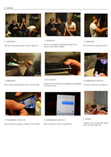
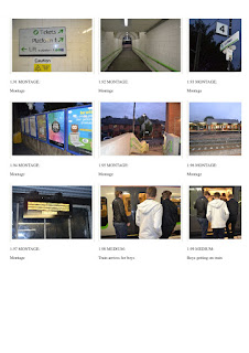
Here is our storyboard, which contains photos taken before production, replicating how our video should look in terms of visual shots.
Our pitch
Below is our pitch, which includes our idea for our music video and explains other aspects such as where our ideas are from.
The Music Industry - Picking a suitable organisation to produce our band
What is the music industry?
There are two forms of institutions; major and minor institutions. Major
institutions are multinational companies that have large scale awareness and
are associated with well-known and successful music artists; for example Sony
Music is a major institution that owns famous music labels such as Columbia
records.
Minor institutions are independent music companies that partner with
smaller independent record labels to help broaden their awareness in the music
industry. For example, 'Boy Better Know' is a London based independent record
label supporting artists such as Skepta and JME.
Suitable organisation to produce our band - Rough Trade Records
Rough Trade Records is in a partnership with the Beggars Group which
allows a further reach of artists due to multiple connections.
The company did, before its bankruptcy, own its own distribution arm
which established the company as being able to grow strong whilst being
independent.
The artists signed, or at one time signed, to the label are vast and
mildly successful. They tend to mostly be artists that are easily grouped into
the indie genre, such as British Sea Power and The Libertines.
Rough Trade Records is an extremely suitable organisation to work with
as the majority of artists signed to them conform to the conventions of the
indie genre, which is the exact aim of our project.
Monday, 19 October 2015
Wednesday, 23 September 2015
Location scouting
To not only visualise but understand our video further, we went out to scout for locations/settings to be used in our piece.
Pub
The pub setting will be key to our video as it represents some of the main conventions of the youth stereotype we are identifying such as drinking, smoking, fights and 'playful banter' between friends.
Small 'corner' shop
This setting creates anchorage for the viewer, helping the characters (who represent the band) feel more familiar, establishing a connection between the band and audience which conforms to the indie genre as this is often an ideal of their persona. It also helps to set up the stereotypcial youth stealing from small shops scenario to be used in our video.
Streets
Streets also create anchorage, and also signify that the characters, the band, are very much on par with the general public as they come from the same background, a standard road.
Train stations
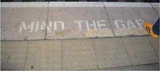
Train stations offer the perfect set up for our characters to be seen in a well known public atmosphere, grounding them in reality and helping the video establish the codes and conventions of the indie genre further.
Chip shop
The chip shop is to be used in our video to show our characters together, not eating fancy and glamourous, but working class. This, like other locations, puts them on the same level as the audience and conforms to the stereotpye of youth eating 'rubbish'.
Shooting schedule + Casting
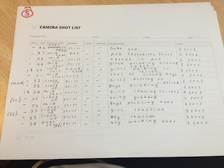
Making a shooting schedule allowed for us as a group to be more organised as to when to film and where, along with the casting helping to finalise the details for actual production.
Casting:
Group of boys - Ross Turner, Stuart Brookes, Joe Cowman
Group of girls - Ella Fahy, Megan Elcock, Lissie Smith
Thugs - Jake Wicketts, Brad Hendry, Lewis Hendry
Boys in pub - Mark Bridgman, Aaron Leiper, David Brown
Shooting Schedule:
Wednesday 7th October - All girl scenes
Thursday 8th October - All boys scenes
Friday 9th October - Pub and street scenes
Props:
Cigarettes, alcohol and lighters - Ella
Glasses, trainers and phones - Lauren
Our band ideas
Here is a mind map of our ideas for our band and also a mood board of things we associate with our band. The mind map includes ideas on our band such as costume and their body language but also settings where we would find our band often and their beliefs and values which will give people a better understanding of our band.
Introduction to our band + Audience research
Our chosen band is 'Contravene' and our song choice is 'What Took You So Long'.
Audience research
To further discover our target audience and be more accurate with what they look for in an Indie music viceo we conducted a survey via surveymonkey:
Create your own user feedback survey
The name contravene means 'rebel' and we thought this was very fitting for our band as they fit into the ideas that bands in this genre go against the norm and make a statement by rebelling against authority.
Contravene is band consisting of 3 males aged 19-25 from Manchester, we chose this band as we feel they are most appropriate at conforming to the stereotypes of music of their genre which is indie. Contravene share similar values and beliefs as their fans of that genre, for example the way they dress and also their attitudes and morals. From our collage you can see the overall look that contravene have, for example the clothing and hobbies.
Audience research
To further discover our target audience and be more accurate with what they look for in an Indie music viceo we conducted a survey via surveymonkey:
Create your own user feedback survey
Sunday, 28 June 2015
Three theories application - Florence and the Machine - What kind of man
To explore the three theories we researched, we applied them all to one music video. Here is the music video:
And here is the powtoon explaining how we applied the theories (Change to 480p!):
Three theories task
Today we were given three relatively new (to us) theories to research. Here is what we found:
Hypodermic theory
Use and gratification
Reception theory
Narrative theory - Music video - Pool - State of mind
Propp
The hero of the narrative is clearly the girl, even if it can be argued she is anti hero due to her almost villanous job. By the end however she is most definitely the hero, as shown through low angle heroic shots. The young male character is actually an countertype to the 'princess' role, as is the female being the hero actually, as the role of the princess is typically a woman. This represents the band as being different and willing to make a statement about sexism and how everyone should actually be equal, a very positive image for the band. There is of course a villain, who is quite stereotypical due to his grim setting and costume along with his motives. It could be argued that the villain is also the dispatcher as he sends the hero on her journey that changes her to become a true hero.
Strauss
There are two opposites presented in the video, first of all there is the heroic woman and princess like man, not only opposite because of gender but also because of their power levels. The other opposite is of course the classic hero and villain dynamic, shown through cross cutting between them and the conflict also.
Todorov
Todorovs circular narrative theory fits nicely to this video. The equillibrium can be one of two things; either the woman going about her job as usual, or the man sitting peacefully at home. The disequillibrium is then either when the man is kidnapped or when the woman sees what the villain does to the man, both events that are negative and set in place the next steps. Realisation comes when the woman stops her car and realizes that what she is doing is wrong, which leads to her to the attempt to repair stage in which she kills the villain and saves the princess. For the new equillibrium, the shot at the end of the video showing the woman and the man at an equal level signifies that they are partners now, and will work together.
Barthes
The enigma code can be applied to this video as halfway through the video it seems as if the hero is just going to walk away, so the audience has no idea what will happen next. The cultural code can also be applied as the video presents a countertype to typical gender roles, so it is testing the audiences morality on if they accept it or not.
Narrative theory - CD cover - Courteeners - Concrete love
The band are portrayed as being heroic due to the clear clouds and the white shirt of the lead singer of the band which makes him look more significant than the others. The lead singer also appears more heroic due to the fact the other band members are wearing dark clothes which emphasises the angelic lead singer. The other band members look like helpers who are helping the hero on his quest but are not as significant as the lead singer and this is shown by the fact that they arent wearing pure white like the rest of them and implies they could potentially be the 'false hero'.
Strauss
The only binary opposites shown here could be bad vs good. This is shown because the lead singer is wearing a white shirt which connotes purity, good and innocence, this contrasts the other band members who are wearing dark colours which shows them to be less angelic and potentially bad.
Todorov
The original equilibrium is the band being united and together and the disruption could potentially be that the other members are not as angelic or on the side as good as the others. It could also mean the fans have a 'favourite' which is the lead singer and this could cause conflict and affect the bands relationship.
Barthes
I think the code in this CD cover is the symbolic code as this is where the audience assumes that a character dressed in black is evil and forms expectations of their behaviour on this basis. This fits this cover as the other band members are dressed in dark colours which people may associate to be menacing and evil when actually they could be on the side of good and this may be a misconception.
Subscribe to:
Comments (Atom)


