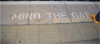
We progressed from our first digi pack draft to our final one as we originally started with the idea of having a pop art inspired colourful inlay, we worked hard on this and then presented it to our class for interim feedback. The audience response was to change this as it didn't really fit the genre and didn't really show continuity with our front and back cover, therefore we changed the inlay to a photo used in our storyboard as it perfectly summed up the indie genre and also it matched our front and back cover. If you look at our final digipack you will see how we have a much more professional and consistent digipack that doesn't just link to the indie genre but also has common themes seen in our music video and advert.
Sunday, 15 November 2015
Final product - Digi pack
We progressed from our first digi pack draft to our final one as we originally started with the idea of having a pop art inspired colourful inlay, we worked hard on this and then presented it to our class for interim feedback. The audience response was to change this as it didn't really fit the genre and didn't really show continuity with our front and back cover, therefore we changed the inlay to a photo used in our storyboard as it perfectly summed up the indie genre and also it matched our front and back cover. If you look at our final digipack you will see how we have a much more professional and consistent digipack that doesn't just link to the indie genre but also has common themes seen in our music video and advert.
Subscribe to:
Post Comments (Atom)


No comments:
Post a Comment