We progressed from our first digi pack draft to our final one as we originally started with the idea of having a pop art inspired colourful inlay, we worked hard on this and then presented it to our class for interim feedback. The audience response was to change this as it didn't really fit the genre and didn't really show continuity with our front and back cover, therefore we changed the inlay to a photo used in our storyboard as it perfectly summed up the indie genre and also it matched our front and back cover. If you look at our final digipack you will see how we have a much more professional and consistent digipack that doesn't just link to the indie genre but also has common themes seen in our music video and advert.
Sunday, 15 November 2015
Final product - Digi pack
We progressed from our first digi pack draft to our final one as we originally started with the idea of having a pop art inspired colourful inlay, we worked hard on this and then presented it to our class for interim feedback. The audience response was to change this as it didn't really fit the genre and didn't really show continuity with our front and back cover, therefore we changed the inlay to a photo used in our storyboard as it perfectly summed up the indie genre and also it matched our front and back cover. If you look at our final digipack you will see how we have a much more professional and consistent digipack that doesn't just link to the indie genre but also has common themes seen in our music video and advert.
Final product - Advert
Upon reflection, and looking at other products of the same nature, we found that our third draft does not look professional enough and therefore we went back to our original ideas of including the shoe, as this will help us create a link across all the products and also give our products one definitive symbol which would help to conform to the ideals of indie artists also. One mistake we made with the third draft was not including reviews or company logos, which we acknowledged and included in our final draft. Overall we are extremely pleased with the outcome due to the professional look and effective wording used, along with the clear link to the other products.
Digi Pack - Drafts
Digi packs final from flubdub135
Draft3:
Digipack drafts commentary:
Draft 1:
To gain an idea of how we would like our digipack to look, we used professional images that we do not own so we knew what to shoot when it came to taking the actual photos. However this was only for the front cover and inlay. For the back cover, we used an original image however we felt as though we could not find a text colour that complimented it.
Draft 2:
For the front cover of draft 2 we used the same image however we wanted to be original and unique (like our genre) therefore we placed the album name on the stripes of the shoe. This time the inlay is an original image we took whilst shooting our storyboard that we actually found more effective than the style we attempted in draft 1. This is because we wanted to stick with the theme of outdoors to link with the iconography of the genre, which we also presented through our music video so they link together. The back cover is similar to draft 1 however we thought the slightly different lighting may compliment the text better, however it did not.
Draft3:
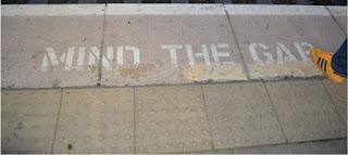
The front cover of our third draft is an original image that is in the style of the professional image we used in our other drafts. We shot this image in the train station setting that our other images (and video) were shot in to provide continuity to our digipack. We decided to keep the inlay the same as we gained positive feedback on it from the rest of the group. For the back cover we used an image that helps to present the band more, as not only were the other images not fulfilling our aims but also the band are not seen in the video so we thought that they needed to be seen somewhere as indie artists are known for their image just as much as their music.
Subscribe to:
Comments (Atom)


